Here Stands the Cabinet – FineWoodworking
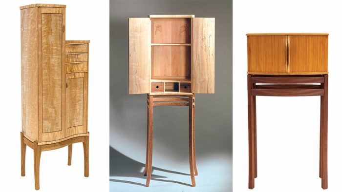
Synopsis: A look at the cabinet on the stand, the furniture type most associated with James Krenov, from the director of the school that bears his name. Students come to The Krenov School chasing the form, and in designing their pieces must sort out a variety of factors before homing in on their design: wood choice, leg angle, dimensions, curves, overall size, and more.
The cabinet on a stand, along with its close relative, the wall cabinet, is the furniture type most associated with James Krenov. He didn’t make chairs or stools or benches, only one desk, and one known dining table.
His focus was the cabinet, the form through which he could explore all that interested him: the visual and tactile qualities of wood, the invitation to engage by opening drawers and doors, placing things inside, and taking them out. As with all basic categories, the cabinet on the stand is ripe for re-invention and re-imagining, hybridizing, and re-composing.
Krenov and the cabinet on the stand
Krenov became fluent in the form; it became his mode of expression, his way of understanding woodworking and of engaging the world. His cabinets varied in size from quite small to just over 5 ft. tall. He used solid wood for some pieces and shop-sawn veneers for others. Sometimes there were drawers, sometimes not.
Sometimes he put glass in the doors, sometimes he played with solid and void. But always the wood, and the woodiness of wood, was central. Apocryphally, he was said to ask a plank what it wanted to be, and the wood always said the same thing: It wanted to be a cabinet.
The Krenov style James Krenov’s aesthetics derived from his background and education. He studied from 1957 to 1959 at the Nyckelviks Verkstadskola in Stockholm, the school that was established by Carl Malmsten in 1930. Malmsten, a prominent furniture designer, was looking back to 18th- and 19th-century Swedish vernacular furniture, using the English Arts and Crafts movement as his guide. Malmsten worked primarily as a designer, though with a deep understanding of construction, joinery, and material. Aesthetically his work combined an almost Biedemeyer refinement and reduction of form with local traditional Swedish furniture styles. Though Krenov eschewed and even railed against industrialized furniture, he did adopt some of the softness, the easy edges, of mid-century Scandinavian furniture, which itself was a humanizing reaction to the harshness of continental European, Bauhaus-influenced modernism. And importantly, Krenov’s pieces are all one-offs, specific responses to a particular piece of wood using the vocabulary of forms and techniques that he had in his mind and his hands. He was not designing pieces for others to make or for mass or even batch production. Either he made speculatively, with the hope of a purchaser showing up, or for a client, someone who had sought him out for his particular approach. This allowed him to take a somewhat rambling approach to the making, permitting changes to occur in response to the wood or a change of mind on Krenov’s part. He referred to his process as composing, differentiating it from the segregated processes of design and manufacture. 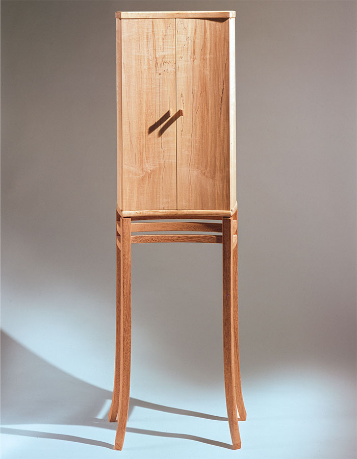 Cabinet of spalted maple. A solid wood, the double-doored concave case sits on a delicate double-stretchered kwila stand with slightly tapering and outward-splayed legs. Photo: The Krenov Foundation. |
Chasing the form
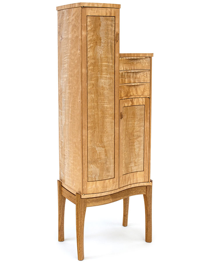
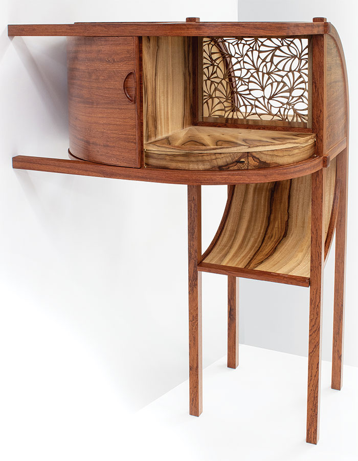
Many students come to The Krenov School to reproduce or closely emulate a Krenov cabinet, others with a more general desire to make things in his style or his ethos. As the current director of the school, I help students explore these intentions, and we start to think about the possibilities. There are cabinets with separate stands, almost like small tables; and there are cabinets with the legs integrated into a veneered carcase; we call these post-and-panel cabinets.
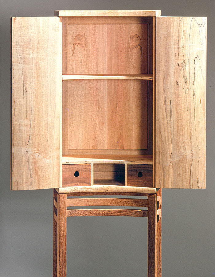
Inside is a typical Krenov interior, with two drawers sitting on the base of the cabinet. Of note here also are the slightly convex sides, flat on the interior. The outside curve softens the transition between the sides and the doors, which would otherwise be an acute angle. In addition, the doors are not strictly bookmatched; the spalting pattern is different though the grain is symmetric. Photo: The Krenov Foundation.
So many possibilities in legs, dimensions, materials
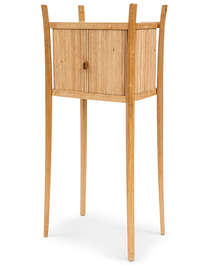
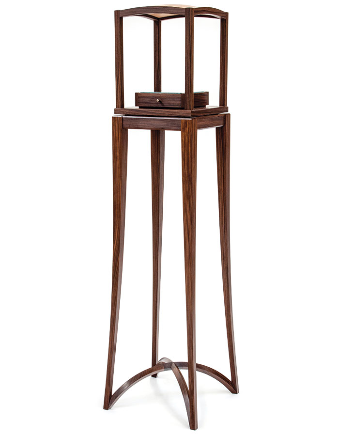
Students often start by thinking about a leg shape, both its profile and its cross-section. If the leg has a curve it must be fair—smooth, bumpless, kinkless. It needs the right amount of curvature, usually less than one first imagines. It is easier to make a cartoonishly curvy leg than an elegant and subtle leg. “Subtle” and “elegant” are subjective terms—more personal taste than anything—and we try to guide students to find their taste.
By we, I mean myself and the other instructors: Jim Budlong, Ejler Hjorth-Westh, Greg Smith, and shop manager and technician Todd Sorenson. Of course, we are not a homogenous group; we have variations in our styles and where we place importance. Krenov was an advocate of curves that vary in their degree—he likened them to a blade of grass leaning in a breeze, with less curve closer to the ground where the stem is thicker, and greater curvature toward the tip.
There are more factors at play, too: What wood will be used? Will the leg be rotated at 45º to the case? If so, the leg is often five-sided in cross-section. The footprint of the stand should be slightly larger than the case, or at least it should be larger to the front, so the cabinet won’t fall forward when the weight of an open door or drawer shifts the center of gravity forward.
What should the cabinet’s dimensions be? Krenov’s cabinets were small. A smaller size intensifies the experience; more delicacy is involved in approaching the cabinet and opening it. There is also the relationship between cabinet and stand: A cabinet is necessarily boxy, enclosing space, while the stand is made of linear elements, lighter, with negative space. The pair should work together, neither top-heavy nor the opposite.
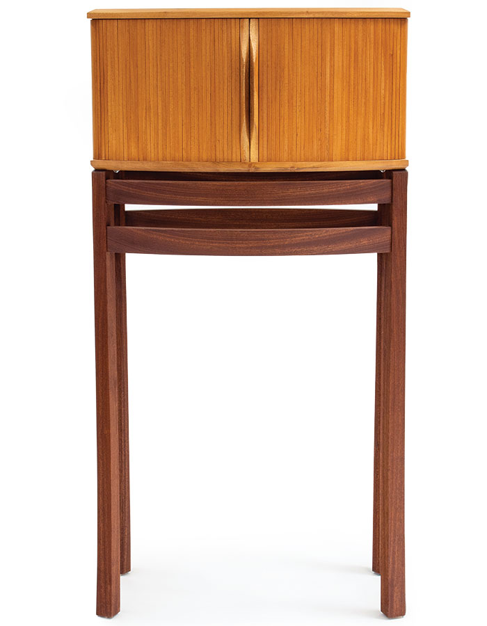
There are myriad variations. The legs can step outward in chamfers—once, twice, more times? The doors can curve—concave or convex? Are the doors frame and panel, solid wood, veneered? Maybe tambour? Should the stand be curved too? Should the cabinet float above the stand or be visually (and literally) attached?
Should there be drawers behind the doors, below the doors, or within the stand? Should there be rails close to the ground, adding visual weight? Should the stand be the same species or different from the case above?
My cabinets on stands
The first piece I made when I came to study at The Krenov School (known then as College of the Redwoods) was of course a cabinet on a stand. It was Krenov’s last year teaching, and though he was sometimes downright bad-tempered, I wanted to participate in his tradition.
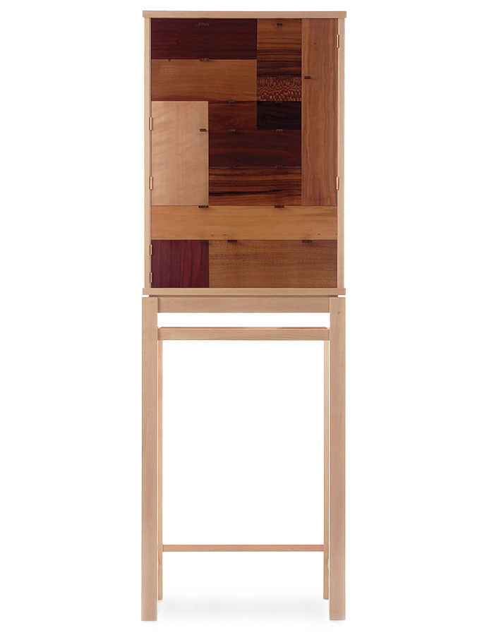
I made a piece with a multitude of different woods as doors and drawer fronts—three doors and 10 drawers on a single, flat plane. Visually it somewhat resembles a quilt, and indeed I salvaged the wood from classmates and the scrap bin.
When I finally stood back from the piece, I thought the similarities and differences with a flat piece of art—a painting drawing, or print—were intriguing. Given that, a cabinet is closed most of the time and given that it sits against a wall, its doors become akin to a piece of art, and the carcase is the frame.
What did this imply for a cabinet on a stand? To be sure, a person interacts with the piece, by opening and closing it, by placing things within it, and it contains space in a way that a paper or canvas object does not. It is simultaneously, and intriguingly, a two-dimensional and a three-dimensional object.
I was also struck by how the stand occupies floor space, while not offering storage in return. This can be resolved by making a cabinet on a cabinet, or by forgoing the stand and making a wall cabinet.
–Laura Mays is the director of The Krenov School.
From Fine Woodworking #308
Design: Is it a learnable skill?
Display Cabinet, the Krenov Way
Krenov on Grain
Sign up for eletters today and get the latest techniques and how-to from Fine Woodworking, plus special offers.
